Before & After: Benjamin’s Nursery Tour
Glimpses of Benjamin’s nursery have been seen around the web a couple of times before (like on my instagram or in my Rue magazine home tour), but today I’m excited to walk you through the design process in full detail and give you a complete product list.
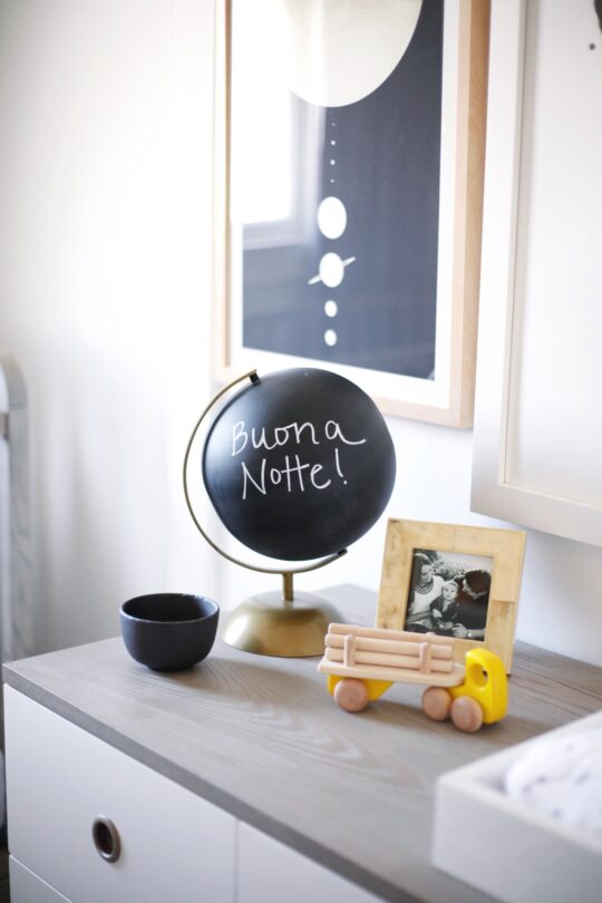
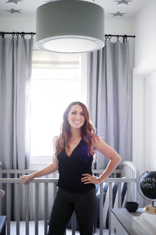
We currently live in a small one bedroom apartment in San Francisco so when I got pregnant we had the challenge of having no extra room for a nursery. Of course, I had thought about this long before I was ever pregnant and always knew I’d transform my walk-in closet into a mini nursery one day. But when I verbalized that for the first time to my husband and parents when I was actually pregnant, their initial reaction was one of hesitation: “You can’t put the baby in a closet!” But no, I thought, just you wait and see. It was important to me that our baby had a special space of his own that was lovingly created just for him. I didn’t want living in a small space to cause me to miss out on one of the most exciting parts of expecting a baby- decorating the nursery! Ultimately, everyone supported my idea, trusted my vision, and loved the end result. So let’s start with the before image when the space still functioned as my (messy) closet:
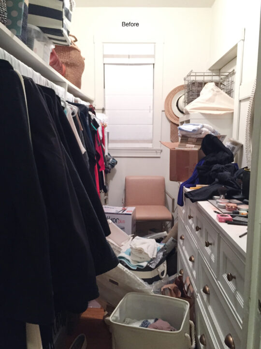
Fortunately, my walk-in was a pretty big space all things considered (my husband has an equally big closet, which we now share). But as you can see, I had neglected to design it and so it often served as a temporary storage for odds and ends and quickly became messy and overcrowded.
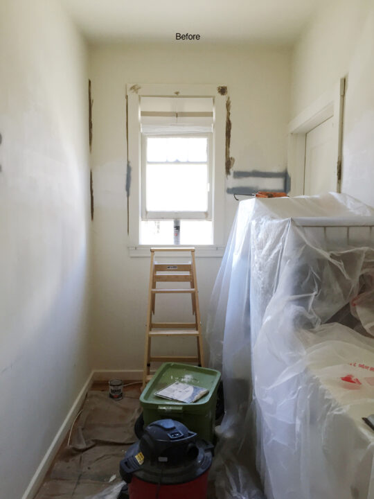
To get started, I had to prep the space. After clearing my closet out, the first thing I did was hire someone to remove the shelf and bar on the left. Then I called in a painter to patch up the walls and paint the entire space in Benjamin Moore’s Simply White. It’s the white paint I always seem to land on because it’s such a pure white (no yellow or blue).
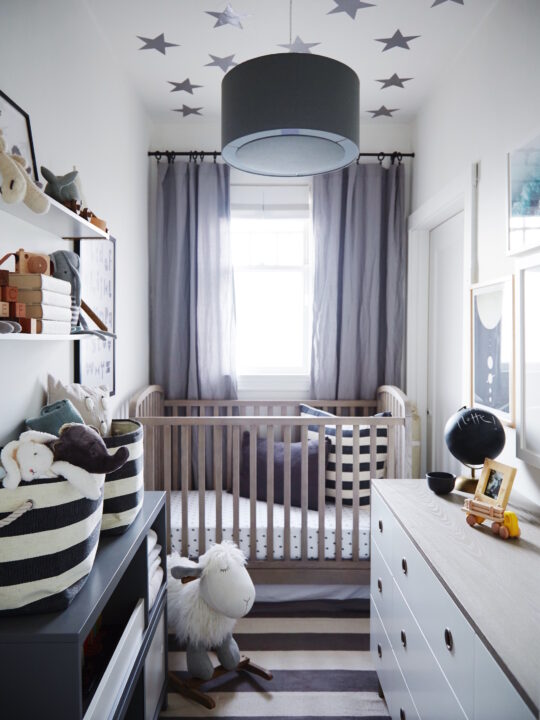
After taking measurements of the room, next up was figuring out my furniture plan. I instantly knew that the crib would go against the window wall – not ideal – but it would stick out too much in the middle of the room if it were on the left or right wall. Functionally, I knew a dresser for all of B’s clothes and accessories would be needed and that I’d put his changing pad on top of the dresser (so, no need for a changing table). I also knew I wanted a few fun pieces for decorating and displaying, like a bookshelf and floating shelves.
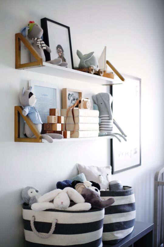
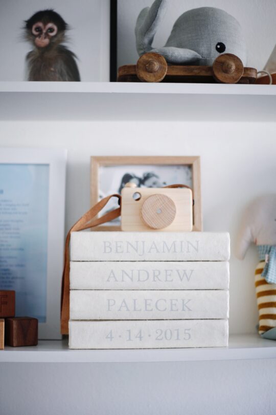
While I was scouring the web for inspiration (you can check out my nursery inspiration Pinterest board here), I found some beautiful rooms decorated with The Land of Nod. So I reached out to them about partnering with me on the space, started poring over their beautiful product, and came up with a design scheme. I wanted the space to feel like a little boy’s room but in a sophisticated way. So, I chose white, gray, and hints of blue for my color palette and selected pieces that I thought would mature with him over time.
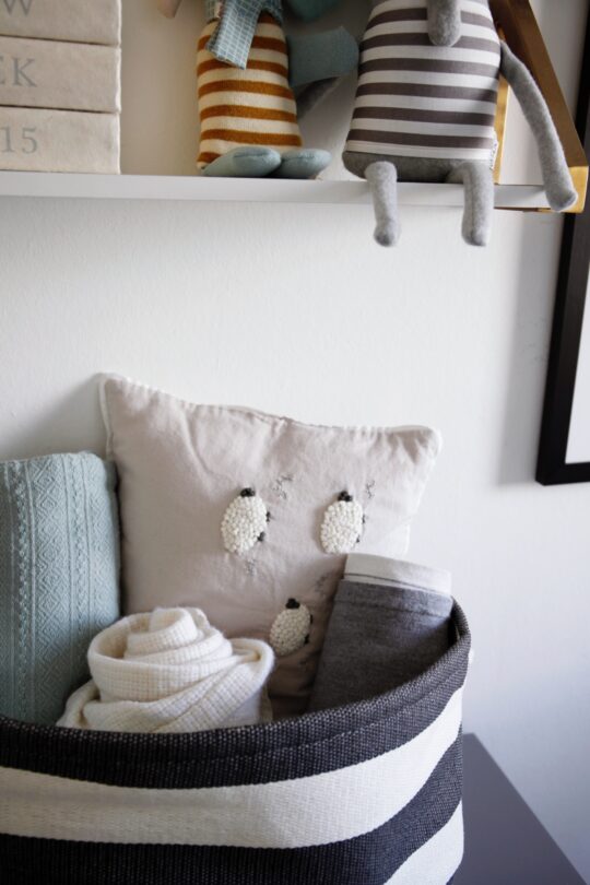
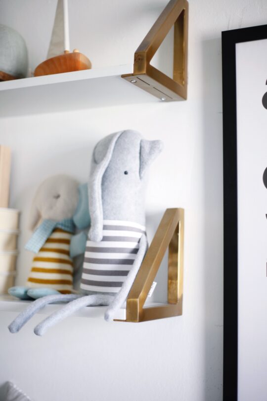
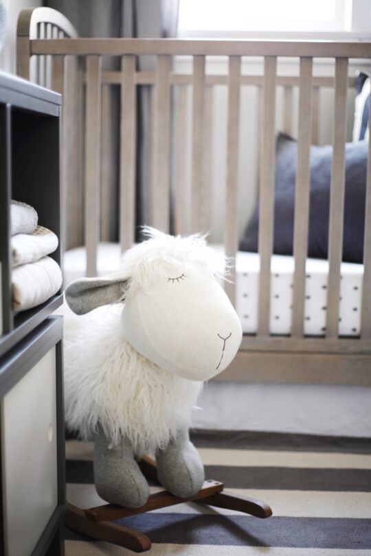
Three things that really helped transform this into a room and to no longer feel like a closet were adding drapery, a light fixture, and a rug. As you can see in the “before” photo, I just had a small roman shade on the window. Not only did adding drapery help visually frame the entire space, I was also able to make the room look larger by extending it out to the far sides of the wall and above the window frame. The pendant helps give dimension to the boxy space and the striped rug adds softness and helps anchors the whole room,
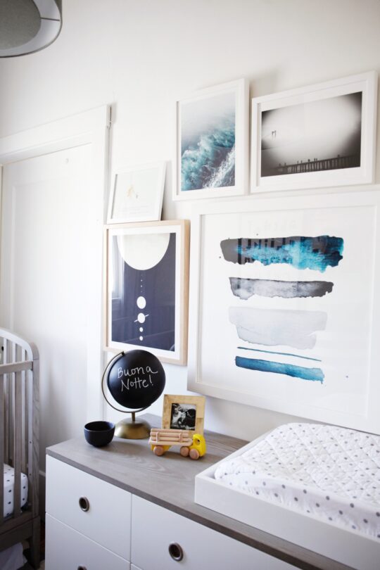
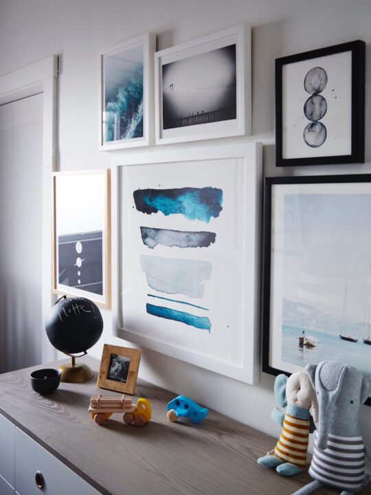
Above the dresser I wanted to create a gallery wall to fill the space and also lead your eye up so the room felt bigger. I turned to Minted, which has the best selection of affordable prints and the option to purchase them already framed (which is a huge time-saver!). Each print I chose has some sort of special meaning to me. For example, there’s a Golden Gate bridge picture, which I chose because San Francisco would be Benjamin’s birth place. And one of sailboats because my husband, Andrew loves to sail and I imagine one day he and B will do that together.
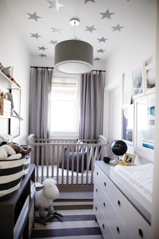

I have to say, I am so pleased with how it turned out. It may be a small space, but it has everything we could possibly want or need. Though this space started out as a closet, with love and intention, any space can become exactly what you dream it to be!
Sources: 1. Archway Baby Crib (Grey) | 2. Crib Skirt (Light Grey) | 3. Silver Dot Crib Bedding | 4. Organic Crib Mattress | 5. Waterproof Crib Mattress Cover | 6. Dresser | 7. District Storage Bookcase (Grey) | 8. Gold Standard Wall Shelf | 9. Grey Light Pendant | 10. Star Decals (Silver) | 11. Linen Curtains (Grey) | 12. Changing Table Topper | 13. Changing Pad Cover | 14. Organic Changing Pad | 15. Striped Storage Bin | 16. Striped Rug | 17. Rocking Horse | 18. Stuffed Animals on Shelf | 19. Wooden Truck | 20. Wood Camera (Similar) | 21. Monkey Print
If you liked this post, you might also enjoy touring the rest of our home.